Designing for speed and efficiency
The growing need for speed and efficiency in technical contexts implies that documentation structure should elevate and respond to this requirement in order to maximize utility.
Designing for speed and efficiency
The growing need for speed and efficiency in technical contexts implies that documentation structure should elevate and respond to this requirement in order to maximize utility.
Scannable interfaces
Information should be designed for rapid absorption, built for skimming with the ability to zoom in or out or to navigate non-linearly in the quest for an unknown solution.

The diagram above illustrates what that quest might look like - multiple paths through a single documentation driven by different objectives, entering and exiting accordingly.
While the site addresses external users, we can review the documentation pages for Storybook to build a framework for what works.
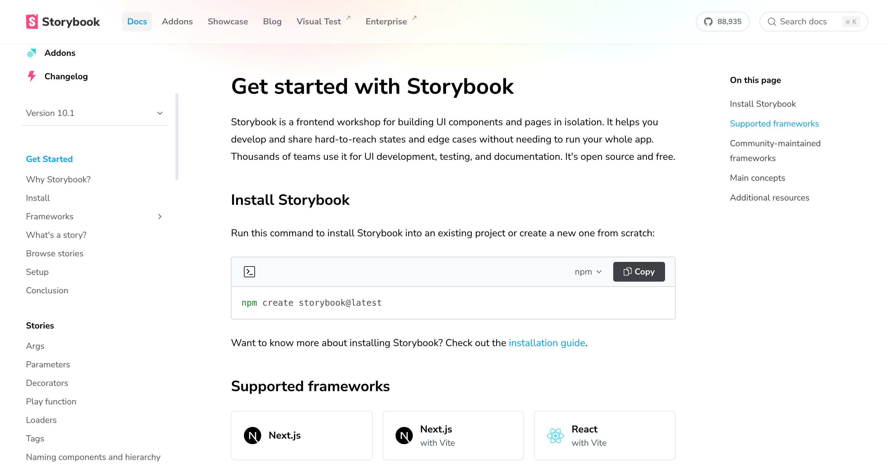
Navigational Clarity
In the screenshot above, we see context menus along the top, and to the left and right of the page. This affords the user simple situational awareness and the ability to navigate with clarity.
Search and Highlights
A search bar in the top right adds to the user’s ability to control the direction of information flow and next steps. Blue highlights promote rapid absorption of critical information.
Consistency & Visual Hierarchy
In the center of the page, the main content section focuses on one topic, providing greater detail. Sections here are clearly demarcated with headers that are followed by body copy and visual aids such as code blocks, links and icons. These elements support non-linear navigation without overwhelming the reader.
TL;DR isn’t a problem to fight, it’s a constraint to design for. The best documentation works the same way good interfaces do: it respects users’ time, attention, and constraints.